 Short Bytes: Using the publicly available data, data visualization software firm Uncharted has prepared TorFlow — a map for visualizing how TOR’s data looks as it flows all across the world. It shows TOR network’s node and data movements based on the IP addresses of relays bouncing around the connections of users to avoid spying.
TOR is the world’s most widely used tool for anonymity purposes (Everything About Tor: What is Tor? How Tor Works ?). It has grown into a powerful network that’s spread all over the world. Surprisingly, the TOR project is transparent about the location of the TOR nodes and thousands of machines that power the network. This non-profit organization frequently published an updated list about the bandwidth and location of the computers and data centers spread all across the world.
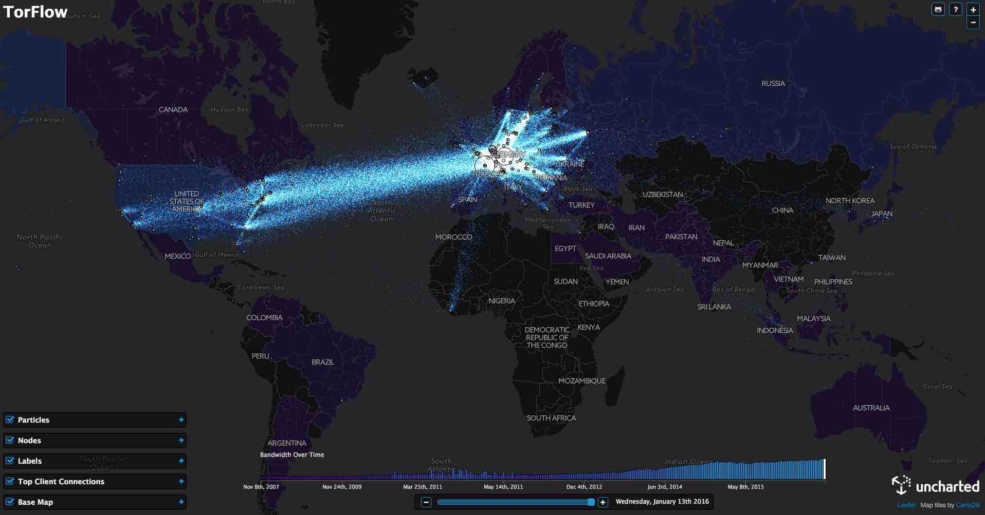
Using the same public data, TorFlow maps the TOR network’s nodes and data flow all around the world. This data movement is measured based on the IP addresses and bandwidth of the relay computers bouncing around the connections of users to avoid snooping, according to Wired.
“The whole point of the Tor network is to remain anonymous,” says David Schroh, one of Uncharted’s software engineers who built TorFlow. “But by visualizing it, can you see patterns you wouldn’t expect.”
It should be noted that Europe shows an unprecedented love for privacy. While the US has more than 1,300 nodes out of the total 6,000, countries like Germany, France, Netherlands, and England are the biggest hubs.
Also read: This Map Shows The Creepy Satellites Passing Above Your Home In Real Time
The TorFlow map also shows the growth of TOR over the years and it’s continuously expanding in Asian and African regions.

How to use TorFlow map to know more about TOR?
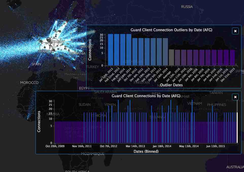
The above visualization shows the information flow between different relay servers for a selected day. In the live visualization map, as you hover over a circle, more information is shown. Also, each colored country represents a region that is responsible for N client connections.
You can click on the country to see the above distributions by time and outlier counts. Using the date slider at the bottom, you can select the simulation date.
If you wish to build your own map, you need node, bower, and gulp. Here’s the GitHub repo for more information on TorFlow map.
Get the best deals on VPN services at fossBytes store.